- Adspire
- Posts
- Turn your UX into a selling story
Turn your UX into a selling story
🧭 How most product pages forget the most important emotion, AI ad systems hit peak precision, and more!

Welcome to Adspire, where every edition delivers insights, strategies, and inspiration to fuel your advertising brilliance. 🤯
Just a quick heads-up! If you stumbled upon us through a friend, make sure to subscribe here! That way, you’ll never miss out on the edition
🧭 The UX Story Arc
Most product detail pages (PDPs) read like résumés, long, impressive, and instantly forgettable.
They’re built for information, not emotion. For clarity, not curiosity.
But in a DTC world overflowing with sameness, the brands that win are the ones that don’t just show a product, they tell a story, and the most underrated storytelling tool on your PDP isn’t your headline or your video.
It’s your information architecture.
When you design your PDP like a narrative that unfolds with intent, every click becomes a chapter, and every pop-up becomes a plot twist.
🎬 From Static Pages to Guided Storylines
A great PDP shouldn’t dump information; it should stage it.
That’s the secret to the UX Story Arc: guiding customers through a self-paced journey of curiosity, reassurance, and ownership.
Think of it like this:
Awareness → “What’s Inside?”, the hook that introduces the hero (your product).
Education → “Why It Works?”, the proof chapter that builds trust through function, science, or process.
Reassurance → “Is This Right for Me?”, the social proof and reviews that calm hesitation.
Upsell → “What’s Next?”, the natural sequel, where you introduce bundles, refills, or add-ons.
Each pop-up, image, or icon is a new paragraph in the same story, one that the customer chooses to keep reading.
🎨 Visual Storytelling Through Interaction
Popups aren’t fluff. They’re emotional pacing tools.
A before-and-after slider, an animation, or a single tactile scroll can simulate ownership before checkout.
When shoppers click “Size Guide” or “What’s Included,” they aren’t just seeking data; they’re rehearsing ownership. That mental simulation is the bridge between curiosity and commitment.
And as revealed in the Semrush × Statista U.S. Ecommerce Report, the biggest conversion gap still happens between category and product pages, the exact point where story-driven UX has the power to create lift.
The report analyzed billions of visits and sales signals across 190 markets, breaking down how leading brands close that gap through architecture, intent mapping, and interactive discovery. You can download it to benchmark your own funnel and uncover where your UX story is leaking conversions.
📊 The Metrics Behind the Story
We tested this structure for a premium oral care brand:
Scroll depth increased by 42%.
Time on page grew by 58%.
Purchase rate per landing page view rose by 31%.
Why? Because when shoppers feel in control of the story, they’re less defensive and more engaged. It’s not persuasion, it’s participation.
💡 The Takeaway
The best PDPs don’t sell; they narrate.
They turn information into rhythm, curiosity into confidence, and design into direction.
Your goal isn’t to build a page that tells everything. It’s to build a page that reveals just enough, one click, one chapter, one emotion at a time. Because the most powerful product pages don’t end with a checkout, they end with a memory.
TOGETHER WITH NEBIUS
Cut AI Cloud Spend Before Your Next Invoice

Every extra day on AWS or Azure burns budget and pushes back your roadmap. Slow GPU queues and surprise bills quietly erode margins while your competitors sprint ahead.
Nebius ends the bleed with free migration and up to three free months, so you start saving instantly.
Operators switching over see 30–50 % lower GPU costs and consistent pricing around $2 per hour, while training large models up to 50 % quicker with instant scaling
Teams like Recraft and Captions already trust Nebius for fast, always-on GPUs and rock-solid clusters that let them ship models without delay.
🎯 AI Ad Systems Get Sharper Across Meta, Google, and YouTube
AI-led advertising is entering a precision phase. Meta is refining app optimization, Google is improving product promotions, and YouTube is clarifying performance data. Together, these updates mark a shift toward transparency, accuracy, and smarter measurement across platforms.
The Breakdown:
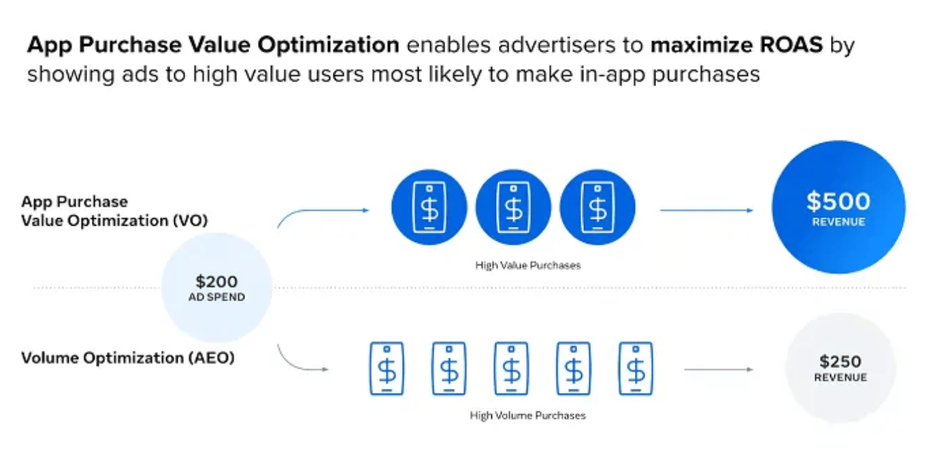
1. Meta Refines Value-Based App Optimization - Meta’s latest AI update improves “Value Optimization,” allowing advertisers to target users more likely to spend within apps. Campaigns using this setting report a 29% higher ROAS than volume-based ones, reflecting a shift from maximizing downloads to prioritizing long-term value.
2. Meta Adjusts Attribution and User Tracking Rules - Through updates with AppsFlyer, Adjust, and Singular, Meta introduced attribution windows up to 180 days for app campaigns, reducing redundant targeting and improving user categorization, leading to 20% fewer mismatched acquisitions across re-engagement efforts.
3. Google Enables Promotions for Top-Performing Products - Google Merchant Center now lets sellers apply promotions only to top-performing SKUs, instead of discounting all products, allowing precise targeting of proven items and a review interface where advertisers can edit or remove listings directly for better campaign control.
4. YouTube Separates Organic and Paid Performance Data - YouTube Analytics now distinguishes organic and paid traffic across views, engagement, and watch time. Channels can filter results by source to evaluate each independently, with YouTube noting that promoted content may expand reach but lower overall engagement averages.
Across Meta, Google, and YouTube, the focus is moving from automation to data-defined clarity. Each update strengthens control over performance signals, helping marketers evaluate impact without overlapping metrics or wasted effort.
🎥Reel of the Day
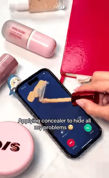
What works:
1. Humor as soft rebellion against productivity culture - The concealer covers “Manager is calling” and “relationship” subtle jabs at overwork and emotional exhaustion. It’s not slapstick; it’s micro-satire. That’s why audiences rewatch it. Subtle defiance performs better than overt comedy, make the viewer feel “seen,” not entertained.
2. Contextual contrast drives retention. - Mixing beauty visuals (soft lighting, glossy textures) with desktop chaos (calls, comments, DMs) creates a jarring contrast. That friction-polished vs. messy is what stops scrolling. Place beauty in chaos; contrast creates stickiness.
3. The caption as a comedic misdirection. - “Our concealer isn’t just for dark circles 👀” ties the humor loop neatly, it’s self-aware, playful, and shows brand confidence. It doesn’t sell, it winks. Treat captions as punchlines, the text can finish the visual joke.
This reel works because it sells through satire. It captures the modern fatigue aesthetic, humor, irony, and aesthetic polish, while still grounding the product as the emotional fix. Veteran marketers should study this as a template for the new ad era: where empathy replaces aspiration, and humor replaces hard sell.
Thanks for reading this edition of Adspire! Keep pushing boundaries, testing ideas, and staying inspired. See you in the next issue with more ways to ignite your marketing success!